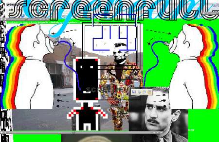
El net.art fagocita la pesadilla de los intrusivos pop up
March 17th, 2005 
 
Several years ago I was on a jury for a Networked art show….
While sifting through endless days of net.art sites I came across jimpunk’s “nowar.nogame.org” . How refreshing to sit back, feel out of control and to be driven along by the browser. Somewhere in the midst of the work was a section where the Twin Towers.. ( the square NYC World Trade Towers variety not the beautiful circular Petronas Towers in KL ) made from empty pop-up grey vertically rectangular browser windows on a plain grey horizontal background, appeared. Then with a strike of thunderous sound, one by one they fell down.. or in more technical terms compacted towards the bottom of the screen.
A short, powerful, simple sequence. Beautiful I thought. Fantastic use of pop-ups. jimpunk goes on my top 10 favourite artists list. I put a link to it on my web site entitled ‘best twin towers at jimpunk”. The net equivalent perhaps to Sean Penn’s moving September 11 short film on death and transformation when the grief and denial of an elderly man (Ernest Borgnine) is healed when light streams into his dark apartment as the Twin Towers collapse.
Funnily enough the work didn’t make it into the net art show, as I discovered the other juror had completely opposite aesthetic sense to myself , and didn’t share my enthusiasm for jimpunk’s work, nor I for the works he liked.
After much negotiation we settled for works we both though were good rather than ones we individually loved [ah the joys of the jury process].
I have wanted to view this fragment of work again, and to show it in lectures, however I was never able to find it. I thought perhaps it was an Easter egg, a little gift for the adventurous user hidden within the site, and it was just eluding me. However recently jimpunk has told me the sequence I recall didn’t ever exist.
I dont quiet believe him – but nowar.nogame.org is offline now so I can’t check for myself. He directed me to 9/11 Memorial, which has a similar use of pop-ups. But the towers are stable, the back ground is animated and they just disappear rather than collapse. It is much more formal, and to my mind a less powerful work than the apparently non-existent one I recall.
So perhaps I was the only recipient of that random combination of windows that became such a potent artwork in my memory. Perhaps it was the optical hallucinatory affect of massively moving pop-ups. Perhaps it illustrates networked art is a truly individual experience. Perhaps it was an illusion – the art equivalent of false memory syndrome – created by mediated tower terror pattern recognition. The only certainty is that the reality of memory bears no relation to truth or falsity
Melinda Rackham
_________________
nowar.nogame.org
http://www.jimpunk.com/www.nowar.nogame.org/
9/11 memorial REMEMBER
http://www.jimpunk.com/NYC/wtc/
Petronas Towers
http://www.klcc.com.my/Showcase/PTT/ps_ptt_overview.htm
Dr Melinda Rackham
artist | curator | producer
www.subtle.net/empyre
-empyre- media forum
originaly from rhizome.org
A Dual-Media Hybrid
–
56kTV – bastard channel – the international online art project curated by xcult.org at the invitation of the Arts Council of Switzerland Pro Helvetia
–
…
–
Jimpunk’s furious choreography of sound and image, too, uses the floss of computer culture, setting Google dialogues, spam headers, pop-ups and typograph-ically constructed figures to a soundtrack of computer noises: error alerts, the digitally simulated click of a camera lens, beats, Indian drums. Underscored by stills from websites and snippets of film music, the wandering, emerging and fading windows take on a filmic character. They are pre-programmed, rehearsed as it were, but the almost simultaneous download of data onto the screen makes them seem like a live performance.
–
…
–
Text: Annina Zimmermann
originaly from mapping-new-territories.ch/exhibition/56_k_tv
WWW.-REVERSE.-FLASH-.-.BACK
FRANCE 2003 HTTP://WWW.JIMPUNK.COM/WWW.-REVERSE.-FLASH-.-.BACK-/ JIMPUNK
. – ..e.. …i..oi.e ..u.e ..i..e..e & ..u. ..a.o.* (revolution)
ART-MEDIAS ET CARNETS DE BÂLE.Viper, le festival de vidéo et nouveaux médias, se tenait le week-end dernier en Suisse.
56k, une chaîne mi-télé, mi-Web avec sa série, son JT, son web-thriller…
Par Marie LECHNER
vendredi 26 novembre 2004 (Liberation – 06:00)
www.56k-bastard.tv
…
Intrigue transpacifique. Certaines émissions se savourent comme des films. Le web-thriller chaotique de Jimpunk Acidmissile  trois minutes à couper le souffle où l’écran, pris de folie, se remplit de fenêtres tressautantes et clignotantes, d’images, de graphiques, de textes et sons grappillés sur le Net  propose une expérience quasi cinématographique du réseau. Comme toute chaîne qui se respecte, Bastard Channel a sa série télé, une intrigue transpacifique en treize épisodes signée Young-hae Chang. Avec son style minimal incomparable (texte animé, en noir sur fond blanc), l’artiste sud-coréenne livre les pensées vagabondes d’un agent secret qui attend son contact dans un café à Séoul. Suspense et rebondissements garantis. Le talk show Nouvelles d’outre-tombe promet aux spectateurs d’entrer en contact avec les morts. Racoleur à souhait mais antispectaculaire au possible, l’animation se réduit à quelques pixels mal dégrossis qui rajoutent au mystère.
…
read more liberation.fr/page.php?Article=256973
Part of a TV station’s repertoire are action movies, and part of a TV consumer’s behaviour is the zapping action. Parisian artist jimpunk’s action movie AcidMissile presents an aesthetics of picture-musicality, a dynamic montage of sound and image, which samples itself through news and entertainment programs’ clichés. From the Comic-Ego to the AsciiCode Warrior to Saddam’s sabre monument, from the googled Western actor to the freely gliding monitor astronaut – the fictitious TV night’s character selection flickers across the computer screen for four minutes. AcidMissile is a graphic punk animation which applies html and javascript techniques in order to produce cinematic effects, a choreographically through-composed zap automation which tells of terror and sends sensible operating systems into turbulences.
Plugin: flash / sound: music / interactivity: – / nerves: oo /
by Reinhard Storz
from 56k-bastard.tv/info
por Nilo Casares
Con una anticipación que hace a su tÃtulo «Diario de un genio» superar la literatura para adentrarse en la verdad, Salvador Dalà bromeaba con el nombre Piet de Mondrian para hacerlo «nyet» (nada, en ruso) por proximidad fonética y apuntar que sus obras serÃan, en un futuro no muy lejano, obras cibernéticas fruto de la facilidad mecánica con que opera una computadora; de paso, ponÃa al expresionismo abstracto de la escuela de Nueva York bajo la paternidad de un cerdo. Pues bien, para contribuir a celebrar su centenario traigo a estas páginas la obra alojada en
Cuando a alguien le hablas de net.art, lo primero que le viene a las mientes es la mano estirada sobre su ratón y el dedo presto a hacer clic sobre un enlace, como si de esa estupidez dependiese la substancia de unas obras cuya interactividad no es necesaria, o al menos no en el sentido banal de necesitar que sea el golpe de botón el que configure una obra que puede correr a toda pastilla ante tus ojos sin que tú hagas nada, y por encima disfrutar de una pieza que puede ser ejecutada con maestrÃa.
Pongamos por caso
Conectados bajo unos patrones que no implican una comunicación plena, y sà un control externo sobre tu posición en el mundo, tus coordenadas de navegación, en pocas palabras sobre tu ubicación espacio-temporal en el momento en que accedes al infoespacio desde tu ordenador, asà estamos en la inet.
En esta primera obra de jimpunk a que me refiero se nota su actitud apropiacionista en un sentido que me interesa mucho, el de adueñarse de tu navegación, en que dejas de ser el rector de tu navegador para caer en sus manos. Pero, en un segundo sentido, también podemos observar su cariz apropiacionista si atendemos a una obra posterior, la última que está desarrollando, y que se encuentra en su cuarta versión,
from nilo@uv.es
Simple Net Art Diagram by MTAA ca. 1997 /
2004.remix ):
:f / Abe + ): =
*
http://544×378.free.fr/(WebTV)/simpleNETARTdiagram.html
an explanation to what really happens
At first the web site www.jimpunk.com is not much to look at. A default-grey background with a rather unexciting table of contents is pretty much it, punctuated only by the simple jimpunk logo, a white-on-black line drawing of a guy with a little body and a big blocky head. You might notice some slowly lengthening dotted lines making their way across the screen. Perhaps the boringness is meant to lull you into a sense of security, but don’t be fooled. What you are about to see may make you think that you have just done something very, very wrong to your computer.
Jimpunk uses html, javascript, Flash, ASCII imagery and animated gifs to create a web version of a rollercoaster ride: scary and fun and at the end you wanna go again. Or perhaps it’s the healthy alternative to a good acid trip. At first, you’re asking yourself, “Is this supposed to be happening?†But after you get over the initial shock, you start to get into it.
Fake4silence is a good starter piece, giving you a strong dose of classic jimpunk without overwhelming you. It starts with a big, white index page. You wait a second, wondering if you should maybe click on something when, suddenly, blank browser windows appear and start zooming across your screen. Some shake, some wiggle. Scroll bars scroll. There is no soundtrack, save the constant hum of your computer, yet the hyperactive browser windows dance to a rhythm you can almost hear. More and more blank browser windows keep opening, one on top of another. It’s as though you are watching a sped-up version of all the web pages you’ve ever visited, only the information has been drained out of them. “This can’t be good for my RAM,†you think, as six more little browser windows pop out of nowhere and line themselves up nicely.
Don’t be afraid, it shouldn’t do any permanent damage.
Now you’ve graduated to Kasselpunk. Here the artist has coded in a random functionality that ensures that you never experience the same trip twice. You might first see the word “µLtr(onfidentiaL†next to a blocky, black-and-white moving image that is so abstracted that it takes a moment to realize that you are looking at a sexy girl. Or perhaps you’ll see a big ol’ ASCII superman, or that damn e-mail from the widow of the assassinated president of wherever. Whichever it is, it won’t be for long. Almost immediately the picture is replaced by another. A tension-inducing drip sound (jimpunk water torture?) plays throughout. You find yourself actually watching, like it’s television, and indeed, there is the word itself, “television,†popping up throughout this piece and many of his projects. But something about this is better than the tube. For one thing, there is no over-emoting actor trying to make you believe his pain; no moron eating worms for your entertainment.
Instead, the artist presents icons of our pop/net culture –superheroes, smileys, video games, soft porn, the cursor, the hand, the button and the browser window– deconstructed, rearranged, multiplied, inverted and played back at breakneck speed. Jimpunk’s art threatens us, the users, by shaking our (already tenuous) confidence in computers. You wonder, “How far can I trust this machine? This software? This web page?†Jimpunk dares you, literally, to “click and crash your computerâ€. And is dynamic, provocative aesthetic leaves you no choice but to call his bluff.
[This article appreared in BlackFlash vol.21.2/2003 page 32]
http://www.blackflash.ca/212
via http://www.furtherfield.org/displayreview.php?review_id=116
This is a soft bitter work that starts off as a quirky flow of red, green and white little pop up windows hopping about the desktop, and ends brimming with intensity and sadness. It is a re-make of Henri-Pierre Roche’s novel Jules et Jim: an obscure story made famous by Francois Truffaut’s 1962 film adaptation. Like Truffaut’s film, this piece is tightly edited to that the first part (perhaps up to the Script Alert) giving us a sense of the lively frivoloties of sexual and emotional goodtimes. As the relationships between the fictional threesome get kinda complex, Maya, Jimpunk and ctgr treat us to an onslaught of freeze-frames, jump-cuts and terrifyingly dizzying movement. At one point, when my desktop was shuddering under the rhythmic flickering of several grey and blood-red windows, the onlslaught became too severe and I hammered at the keyboard trying to find an escape. I was ignored, and the pulsing taunts continued, made more extreme by a tiny pause, a little breath that seemed to offer me some control, some voice. I walked away and when I returned all was calm and an elongated mock browser window sat quietly to the left as Kraftwerk’s Computer Love played gently alongside. Now if that isn’t tainted and twisted love, I don’t know what is.
Reviewer: text provided by Kate Southworth
The word “network,” at least in a social sense, seems to have a connotation of closedness. Think of the term “networking” – it refers to making connections with people within a fairly tightly defined circuit. A network can be a “community” – and that’s a Good Thing. But it can also become a clique, sometimes missing ties to other networks with interesting commonalities.
I have a somewhat mixed/mixed-up professional background, possibly due to my short attention span. Maybe that’s why blurry taxonomies always made more sense to me than crisp ones. Art and programming always seemed to me to make sense together – both somehow teeter on the edge of verbal and non-verbal subjective expression. But the combination of the two has
proved in some cases to result in something much different than the sum of its parts – leading us to something that’s come to be called “software art.”
A nice thing about software art is that it’s experiencing an identity crisis – sometimes it goes by the name “software art,” at other times it’s called “artistic software.” Which word to put first? It can also sometimes be found under even more puzzling labels like “interesting software,” “strange software” or “Hey, check this out!” The point is that it’s both art (if you like that term) and software (fewer complaints about that one, somehow) – and that it’s made by self-described artists, self-described programmers, self described none-of-the-aboves, and self-described all-of-the-aboves.
So, to get to the point: when Eduardo asked me to invite two people to this project from my “network,” I decided to invite two people I didn’t know, but whose work I find interesting – so as to try to extend out the network a bit. I invited Jimpunk and Josh Larios, who both create software projects in which algorithms exude strong “personalities,” at the same time revealing something about contemporary culture.
Jimpunk works in the explicitly “art” side of software art. His projects, including “Gogolchat” (with Christophe Bruno) and “d2b vs. Jimpunk” use text, images and sound from the Internet as their data material. But software is algorithms as well as data, and it’s Jimpunk’s algorithms that distinguish and personalize his work. Through deliberate algorithmic sequencing, juxtaposition, and timing, net data a la Jimpunk becomes choreographed net-cinema narrative, rather than what could otherwise turn out to be a nihilistic, random, data-overload mush.
Josh Larios comes from the “software” side of things – my favorite works of Josh’s are his algorithmic text generators: Turing tests with a twist. Traditional artificial intelligence algorithms try to convince the audience that computers “think” coherently – which presupposes that humans think coherently as well. But projects like Josh’s “The Adolescent Poetry Generator” are more modest regarding their assumptions about both computers and humans – they admit that computers don’t make much sense –
and often, neither do humans. In the case of The Adolescent Poetry Generator, random bits of angst-filled text flow into one another not-quite-seamlessly. The fun is not in the algorithm’s transparency, but in its opaqueness – instead of an AI bot amazing us with how much it acts like a “smart” human, we’re reminded that humans can often amaze us with their disturbing similarity to AI bots.
So, while Josh and Jimpunk work with different content and have different approaches to software, both work with the subjectivity of algorithms in a cultural context. Hopefully their combined presence in the P2P network will somehow spawn even more strange and exotic things… perhaps an adolescent net image generator – oops, no, better strike that – we don’t want any algorithms winding up behind bars…
– Amy Alexander
November 2003
You can’t escape jimpunk. I tried, believe me: it was easy to be disillusioned with net.art, with so many new works showing up on the list-servs plunging so far into the morass of conceptualism that both the “net” and “network” properties that have always distinguished the medium seem to have submerged somewhere deep below the surface of the current aesthetic set as to be almost imperceptible. I definitely don’t want to write this essay, much less look at jimpunk. I think this net depression began for me around the time I encountered a piece by Eryk Salvaggio in Whalelane (http://www.whalelane.com) that was, if I remember, purporting to be an “mpeg haiku.” (http://www.whalelane.com/esalvaggio_mpeghaiku_house.html) What I got when clicking here was a few linear, non-interactive films of jets in the sky and other objects visually reminiscent of straight lines. As a conceptual gesture, the work was genius: an extended pun on the form of haiku, the video being “linear,” the jet trails being “linear” (ah, but look, look at the tension in that: it’s a linearity we see melt away before our eyes): each video also being a line. Yes, beautiful when I thought about it. But for some reason I craved spectacle, the sensual: I had been poisoned by Horace, searching art to give me “pleasure.”
So Marc said, well, write something about jimpunk. Take this link. The red pill, the blue pill. Marc sent me to http://www.jimpunk.com/_____________1_____________/ , which I, attempting to exonerate myself from my recent deep-fried badness, tried. I was suspicious at first: wasn’t jimpunk illegal in the States? What if my mother walked in as I was looking at one of jimpunk’s sites; what would she think? So I chose the dead of night to schedule my visit, and prepared myself by insuring that everyone in the city was asleep. I was able to do this by paranoiacally peeping out all windows and doors in my apartment, and making sure I smiled extra wide at any old ladies I ran across in the city during the day. No base sensualist would smile so brightly!
jimpunk snaps on your screen with all the verve and whimsy of Stuart Davis (http://www.ibiblio.org/wm/paint/auth/davis/). Remember Stuart Davis? Situated somewhere between dada and early abstract expressionism, Davis dipped a paintbrush in the conflagration and cacophony of emerging urban life, then wrung it across every canvas he touched. He inherited from Braque and Picasso a feverish urge toward college, and a love for the detritus of modern life. Just as Picasso’s daily newspaper nudged its way into certain compositions, the new neon signs and electric boulevards of cities bubbled out of the confusion of color that Davis felt.
But there’s something, well, much more primal, almost tribal, in this here site of jimpunk’s.He has a fondness, in ______________1_______________, for the visual impact of early video games—pixelization, my friend: monochromatic and dichromatic grids. The site seems to be a collection of animated DHTML pages, stitched together via javascript, to reload and refresh randomly into each other. One fullscreen composition melts into another; images, functioning here (WARNING: CONCEPTUALIST INTERPRETATION AHEAD!!) as tropes, collide both metaphorically and literally across your screen, sketching thin strands of association. Is that a young Don Knotts (http://www.worldofcheese.org/knotts/) I see there, Marc? Is that Pac-Man?
These grids and boxy robots that slither and flit across the screen remind me of Native American textiles (http://www.kstrom.net/isk/art/art_clo.html). Can you see it? Does not the cheesy robot, black and white and square all over, evoke for you earlier representations of man, lost (or fully in control?) of a halo mosaic of phenomena, of WORLD? Not to imply that jimpunk is working in a digital primitivistic style here; the work seems innocent, yes, but not naive: this resemblance to earlier textile artforms is intentional, and there seems to be some irony involved as well: you, as audience for this work, are invited to make the connection between the past and the present, between navajo textiles and early ’80s Pac-Man, not simply on the visual level, not simply in similarity of pattern, but also ideologically. With the lingering war in Iraq on everyone’s minds, and the United States in particular sliding backwards into a fascistic mode of government post 9/11, jimpunk seems to be laughing at us–not harshly, mind you; it’s a gentle, chiding laughter. jimpunk is no cynic.
It’s that lack of cybicism and gentle criticism that helped me past my net depression. After a few nights of clandestine visits to jimpunk’s project, I feel much better about net.art, even hopeful in my own way. I have, however, noticed certain sexual side effects; the toaster has been looking mighty attractive these days, and I get a strange fluttering thrill now whenever I plug data cables in…
Reviewer: Lewis LaCook
from furtherfield.org
Jimpunk.com http://www.jimpunk.com
Automation
The site is mainly characterized by it’s automation. All of the pieces presented to us in a sequence. The piece would automaticaly cycle through its content in the sequence it was designed. At some point it stops at a loop until interaction from the user is invoked. This interaction can either be a click on a link, the position or scroll of the mouse. The pieces seem to be in natative form though some of them I just can’t follow or they simply don’t make sense. A script in the page creates and destroys, moves and reisizes a great number of pop-up windows which are relevent to the composition.
Variability
The Jimpunk website collects pages in a sequential order and runs them against various java scripts in the database stored on the server, seemingly to the narrative of some sort of social comment. These comments are litterally interpreted in many parts, however the majority are implied through the actions of the browser invoked by actions of the user v.s. various hyperlinks. The images and browsers apear in various sizes, colours, and for different amounts of time. On the index page the user is offered their selection of work, and those pieces toy with our control that we are accustomed to.
Transcoding
Script kidding at its worst
Jim Punk’s art is largely inspired by the symbols surrounding computer imagery and especially icons. Flying windows, flashing colours and pixelized picture are following one another into what seems to be a big mess of javascript soup.
Borrowing from old and new computer culture in the way he creates images, especially with that little logo/character he created for himself, Jim Punk brings a new life to it by bringing it into a new context. Creating dynamic mosaics out of old patterns used as background in older mac version are but one example in which Punk takes what could be called obsolete culture and presents a new interactive piece out of it. In that sense Jim Punk is effectively transcoding computer culture’s imagery.
He plays a lot on the structure too. Using the container, in this case Internet Explorer, to graphical ends as opposed to just something in which we’re supposed to view webpages. At some point you even loose control of what is supposed to let you navigate and that can also be related to Malevich’s transcoding.